Saturday, August 11, 2012

Exploration lot 3: Textiles/Ornamentation.


This textile ornamental pattern, which uses various circles of raw silk in a 'bruised' palette, is intended as a stylised representation of an inflammatory skin condition called Erythema Nodosum - a condition considered a flag for various underlying disease process. I owe my inspiration also to Gustave Klimt whose decorative style and ornamentation (see below) have been long time inspirations. Interestingly I have since discovered in my research that these highly visible skin lesions signal, among other conditions, Syphillis - a disease said to be rife in Klimt's turn of the century Vienna and one that terrified Klimt so much he  include representations of it in his work. Some sources seem to suggest that Klimt contracted Syphilis early on in his life and that the illness was a contributor to his death though this seems difficult to verify. Nonetheless for myself I love that the association I made between Erythema Nodosum and Klimt's ornamental style portends some extra depth...


Tuesday, August 7, 2012

Exploration lot 2: X-ray and Photoshop.


Here is some exploration using Photoshop and an X-ray. This draws on my 'anatomy' inspiration file, looking at  ideas of illness (from a personal perspective) plus just a more objective fascination with human insides  - physical and the inferred metaphysical - and general other X-Ray related metaphorical  dichotomy such as revelation/denial; inner world/outer world; private/public; protection/exposure...
Experimenting with filters and the eraser tool at about 50% opacity (done quickly, so no Wacom tablet used unfortunately) here some x-ray type shadowy mark making which felt like a really useful discovery. 
Treading then into textile territory, which feels very much where I'm heading and in line with themes I'm playing with, I sketched a shadowy dress onto the x-ray - something outer now on the inner - so getting into my theme of fashion as symbol and metaphor. Metaphor for what? Not really sure, probably serving as hope/future affirming when juxtaposed with illness?
Third a photo of a heart I cast in plaster last year superimposed on the X- ray now looking more solid and earthly against the ghostly X-ray.

Sunday, August 5, 2012

Material Exploration: Blister Packs.


First bit of material exploration off the ranks: painkiller blister packs. These seem to me to have some potential though not sure what yet. But seeings as I have stored approx one half million of them in the garage over the last two years with a view to upcycling them one day I thought now might be a good time. Also as I have consumed their contents over that same time frame I feel there may be some thematic possibility there too. Gathered together they look to have a bit of a silvery, glittery bling quality so I'm thinking bling, fashion, party, pain, denial and working with personal themes to begin with. I still haven't played with these as much as I need to but here's what I came up with last Thursday. As I'm feeling really drawn to a textile challenge this semester I cut the little blisters out, leaving in as much foil as possible to turn them into sequins. Then, some machine stitching, experimenting with leaving thread uncut and otherwise uncut. Different arrangements etc etc. Feel like there's more to be done here, but a start at any rate.

Saturday, August 4, 2012

Word Of Mouth: Encounters with Abstract Art.

Ruth Waller Op Phase (Visitation).

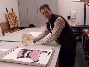
Wednesday's studio class was an absolute treat. A trip to CMAG (Canberra Museum and Gallery) to take in some abstract art - the engagingly curated exhibition Word Of Mouth: Encounters With Abstract Art  showing the works of Nineteen emerging and established artists, working in a variety of mediums, and who are all connected in some way to Canberra through the Australian National University's School of Art - either through teaching or studying. I have always been fascinated with abstract art, in the way I have been with classical music - that is to say felt that there was a whole secret world out there I was unable to access, able to enjoy only for an initial asthetic appeal, and therefore missing something special. The beauty of this exhibition however is an accessibility, something it's curator Mark Bayly had intentioned with the curation, looking to appeal to a broad audience. We were lucky enough in fact to have Mark as a personal tour guide and in the half hour he guided us through the exhibition I felt the mysteries of abstract art both fall away and deepen - a door open into this exciting world of communicating with abstracted form (a particular work by Christopher Carmody, referencing faded book covers, was unexpectedly moving) leaving me not only eager to seek out more abstract work in the future but maybe even try some myself. Though I can only speak for myself I'm pretty sure the whole class left the exhibition feeling inspired.

Greg Hodge (detail from Magazine Mystics). 

Julie Brook (I Can Connect Nothing With Nothing).

CMAG Curator, and our personal tour guide, Mark Bayly, with works by Marie Hagerty. (Photo Source)

Wednesday, August 1, 2012

Inspiration: The Great Gatsby and Jack White.


The Great Gatsby is one of my favourite books. It left me with such a feeling of haunting emptiness for the newly rich Jay Gatsby, the title character, who had given his entire life over for the love of someone ultimately unworthy. Baz Luhrmann has just remade the movie of the novel with Leo Dicaprio as The Great Gatsby and if the trailer is anything to go by I have hopes this will be more Romeo + Juliet and less Moulin Rouge ( a sad disappointment of a film, not to mention a colossal waste of sequins). 
Most inspiring of all though is Jack White's cover of U2's Love Is Blindness which Luhrmann has included in the soundtrack and you can catch in part on the trailer. This song seems like the ideal choice for the empty hedonism and hollowed out alienation Gatsby's pursuit of Daisy symbolises. I have to admit I've become a little obsessed with this song. It's one of those which has the power to rip through any number of thick muscled layers of defence, uncovering in the process the heart of pure, raw emotion. 
I've posted in from You Tube the whole song below so you can hear it without any visual cues. See what you think!


Saturday, July 28, 2012

Advanced Diploma: Inspiration.

Four weeks holiday down the track and here we are ready to tackle a new brief. This semester promises to be exciting as it it culminates not just in a body of work of our own choosing but also a group exhibition - focusing on the creative and logistical skills needed for putting an exhibition together. As usual I am excited but daunted.....
So a fun start - gathering pieces of inspiration. Thinking about what inspires us and how we use that to spring board to a new work. This is pretty much my hobby - gathering inspiration. I wish someone would pay me to do it. Here's just a fraction of what I gathered from the web.

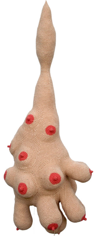
Starting with  this crochet anatomical piece by Cecile Dachery which works for my interest in textile based art and another interest - anatomical subjects.  I love this contrast of the cosy comfort of crochet and knitting with something which is essentially (to me at least) grissly. Grissly in a good way.

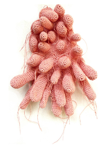
More fron Cecile Dachery....
And more...
I can't get enough of all this subverting of traditional craft. The above is a far cry from traditional knitting and crochet (they don't call them granny squares for nothing). Something really feminist about these two above. What do you think?

Next inspiration: text based art. I like this from Mike Monteiro which seems to me to be about power dynamics and manipulation. Or what? It's stayed with me quite a bit today anyways.


Then how to go past Banksy? He just gets it so right. 


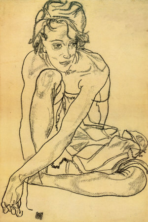
I'm also constantly inspired by Egon Schiele's drawing style. Strong unsentimental linework. They make me want to grab a sharpened pencil and get drawing asap.


As I say this is just a mere fraction of what I gathered but had fun doing it. Look forward to seeing what others are getting into.

Shifting Perspectives: Let Them Eat Cake.


Fast forwarding a whole semester now, having finished the Diploma in Visual Art. Not without difficulty though. I struggled pretty much from beginning to end and while I managed to get my ideas across and was ultimately satisfied with the concept, I never felt confident with the execution, consistently feeling on the back foot the whole semester. It wasn't even till the end I really understood what I was trying to achieve. And that goes for the course too - what it's systematic process was aiming at. Generally just a difficult semester to gain any objectivity. But success in the end I guess you could say - I learnt a lot. Which is how I would describe my whole CIT education experience - learning a lot in a short space of time: intense.
The diploma brief Shifting Perspectives required the creation of body of work which aimed to shift the viewers preconcieved beliefs on a particular topic. My work was inspired by by a comment by Chanel fashion designer Karl Lagerfeld that went something like.... "This is how to spend your money, but spend it in style. There has never been so much money around here as there is at the moment" which had me wondering at the insensitivity of a comment like that when half of Europe is beleaguered in debt crisis. And thats to say nothing of the millions in the developing world just struggling for subsistence. It put me immediately in mind of Marie Antoinette's infamously insensitive line "Let Them Eat Cake" which set me off on this path of taking a fashion magazine focused on luxury and then satirising both it's text and imagery. Fashion shoots set in a Darfur refugee camp featuring military chic for example. $48,000 Dior bags juxtaposed with sweatshop districts. You get the idea...


A couple of nights before I was ready to present I was all photoshopped out and desperate to use my hands making something so I used one of the cover posters to make a basic zine which I then stitched bits of satirised text and imagery, also from the magazine, into and slipped in between the pages of the main magazine as one of those annoying extras that fall out of a magazine when you open it up . It ended up being my favourite part of the work.....which just goes to show what happens when you finally relax....


PS Sorry for the dodgy grainy photos!

Friday, December 9, 2011

All Done Now....


Da da. The finished work which was handed in yesterday morning. A package which consisted of a zine, some postcards with a blurb of info about myself - and what kind of art I try to create - and then a box of mini notecards with further examples of my work. About twenty four hours before I handed it in I asked my partner to read the zine. He said it was "a bit depressing". I thought Oh my god, he's right. Why would you want to promote yourself as depressing? You wouldn't. I had been aiming more in the direction of "Hope". I took the first real objective look at it and had a bit of a freak out about how 'wrong' it all was and what in fact had I been thinking the whole time???? I have to remind myself that with creating sometimes you just need distance before you can make an accurate judgement. I still like the concept of what I was trying to say with the zine and am keen at some point to re work it. I do like the mini notecard concept however. Next time though will go for brighter colours. After all am cheerful, happy person.....am not depressing.....

Saturday, December 3, 2011

New Zine.


Here are some illustrations from the zine I'm just finishing up for the last of this years assessment. This has been a photoshop heavy exercise and I feel as though I have really 'skilled up' with my Photoshop this term. Nonetheless I'm two weeks past the deadline with an extension and my pervasive health problems have me literally dragging myself towards the finishing line.
The zine is about the years I spent in my twenties bedridden (love that word - it's just soooooo 19th century) and all the fashion trends I subsequently missed out on. I can't wait to get it to the printers tomorrow and will post more of the finished product when  get I it back. Zines are lot of fun - I recommend them for anyone in need of a bit of self expression. Anyway beter get back to work. Hope everyone is having a great weekend :)

Thursday, November 10, 2011

Have a heart - Installation.


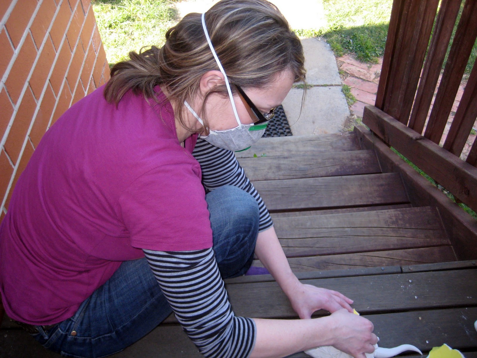
Here are the fruits of my labour for last terms work which looked at the theme of 'intimacy' - through the production of multiple plaster castings - for an installation work on the theme. I know I say this every term but I think this is the hardest I've had to work so far. The process pictures of creating the latex moulds and casting the plaster are below. The first step  - creating the clay positive, which were the hearts themselves, then painting the positives in latex - making sure the 'undercuts' were supported by latex filled cotton wool - nearly did me in. I had the flu at the time and found it all so demanding and finicky (the liquid latex smelt literally toxic) I swore it would be the first and last time I ever made a latex mould. But then when it came to the casting I took my time, just doing one batch of plaster a day, out in the sun, no pressure, and I got excited about what this process can achieve. Making your own mould and then having the option to just reproduce from that opens up a lot of possibilities. 

The liquid latex smelt like the ammonia from a hair salon. It took about six coats to get this thick. It has some stretch but not a lot surprisingly.

Fun plaster casting in the sun - I needed 15 hearts in total.

OH&S photo opportunity.

My installation chose to look at intimacy in the context of a hospital - the concentration of such intense  life events in a single space contrasted with the sanitised lifelessness of the building itself. It helped that the heart is a traditional symbol of intimacy but to represent it as it is - a bloodied, messy organ which sustains life - pushed the metaphor a bit further than that. I've enjoyed playing around with concepts in this course as much as I have the materials themselves. I can't believe I've only got a few more weeks (and still soooo much work) to go. Actually, I can't believe I've made it this far.....

Wednesday, October 26, 2011

1950s Fashion Print.


Was nearby my most favourite bookshop the other day and couldn't resist popping in and adding another ten books to my wishlist. Every where I turned was another title to drool over (not counting Boganomics which, while making the list, was an exception for not being in the Art and Design section). If I had to choose just ONE of those books for my family to get me for Christmas (and I do, since we're on a the "Life's Not Just One Big Bookshelf" budget) it would be 1950s Fashion Print by Marnie Fogg. In addition to the beautiful quality of the prints and literal feast of mid century textile design  the cover is cloth bound. Do I need to say more????


Oh, I forgot to mention Marnie Fogg's campanion book to this (just in case some rich relative secretly finds my blog entertaining and is loitering here) Fashion Illustration 1930s to 1970s. It's cloth bound too. Like I say, just in case....


Wednesday, September 7, 2011

Kokeshi Doll Chandelier


Bigger than than the sum of it's parts? For my daughters bedroom I made this chandelier, combining two of our favourite things - Kokeshi dolls and an old chandelier -a lucky junk shop pick up for $5. The kokechi dolls were a fair bit more expensive than we would have liked but by then we were fixed on the idea and just had to run with it....