Wednesday, March 12, 2014

Portrait Wall meets Side Show Alley.


I'm thinking about how I want to have some fun with this exhibition, get genuinely creative and enjoy it beyond what is the inevitable hard work. In some ways I have a bit of a bad attitude. I've been doing this long enough now to know my MO which is to agonise for months in a sort of semi paralysis and then pull it all off at the last moment. Which is to say good the work eventually gets done, and my best creativity is under pressure but ugh, what a way to ruin a year of your life (or rather seven months - the clock is ticking). And anyway you never can be sure the work will get done.
So then here I am ready to embrace the workload and make it fun. The subject matter is a little dark (mortality, corporeal fragility) but essentially this is a life affirming body of work. With a sense of humour and hope inbuilt - thanks to the over arching context of existential absurdism and it's visually manifest twin the vintage circus sideshow.
Firmly in place as context is the Victorian era. The moment in history for these kinds of side shows/ fascination with the Freak/curiosities. And for the age of the Invalid. So I was thinking about the gallery as installation - A kind of Victorian parlour. The sort where Freaks had their photo taken and where the Invalid saw out her days. So as a cross referenced presentation: the portrait wall meets sideshow alley. Suspending all concerns with logistics, ideally this wall would have ornate peeling wallpaper and be salon hung. A variety of framed works with a mix of Victoriana (ornate embellishments, needlework, curiosities, poetry) and vintage circus (my inlaid rulers, stripes, nails, mirrors, red and white, spires, bling).
Ideally it would be great to have an old chaise (I saw one on ebay which had a cushion seat but no cushioning on it's back, just the timber shape and it would have been PERFECT. I could have painted it black chalk board!!!!) and an old side table painted chalkboard black for the presentation of the artists book.

Victoriana: wallpaper, vintage medical diagrams, curiosities, needlework, chandeliers, ornate fixtures, fringing...)
Vintage Circus: Red and White, inlaid rulers, mirrors, nails, bling).

Behold: the gallery of inspiration......


(and note here about further avenue of exploration for this body of work - the photograph as important contextual element - ways of seeing , ways of presenting someone as outside or insider. Reading Susan Sontag on Photography...)

Wednesday, February 26, 2014

Emerging Contemporaries.

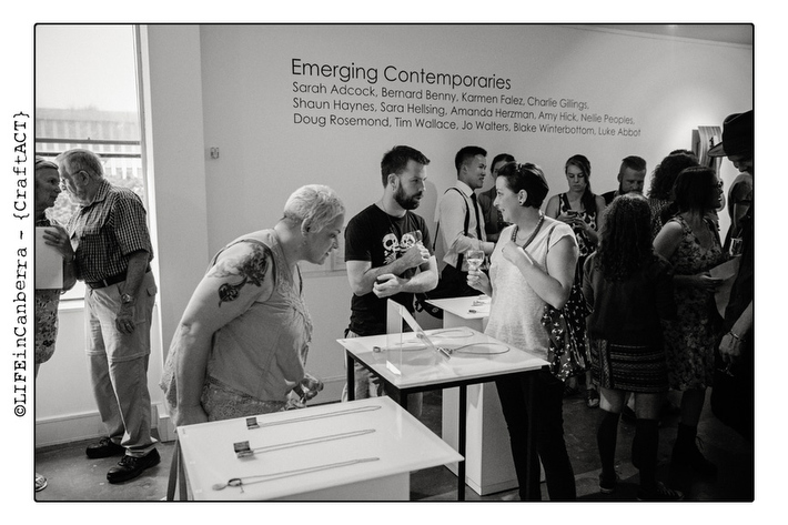
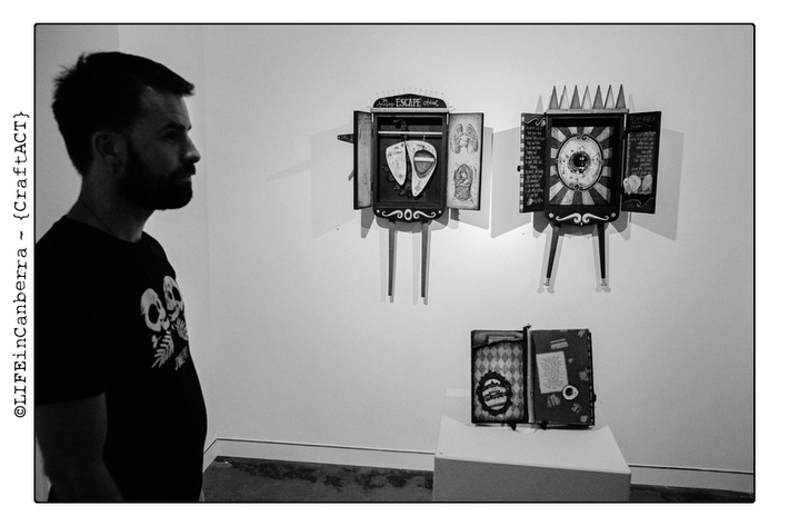
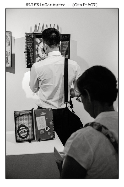
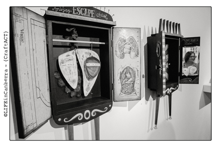
These photographs of the Emerging Contemporaries exhibition are by Andrew Sikorski of Art Atelier Photography. Andrew's online photographic magazine Life In Canberra caught my eye a couple of years ago with a photo essay on the life line book fair, not an event I imagined would lend itself to his quietly poetic black and white style. While my experience of the lifeline book fair is of queues, crowds and an only just tempered jostling, Andrew managed to somehow capture the event from the point of view of the books - a dignifying process, otherwise lost in that atmosphere of competition and trade. Anyway I've been a fan ever since so how happy for me that I now get to see my own work through his lens - a quiet and contemplative perspective, a step removed and layered over the drama and colour of my own approach.
By chance too that is myself in the top photo reflected by the mirror!

Friday, February 7, 2014

Altered Book.


Here is the artists book/altered book I "whipped up" this January for the Emerging Contemporaries exhibition at Craft ACT this month - an exhibition for which I had hoped to do a whole lot more. Suffice to  say 2013 didn't turn out like I imagined it would. 
This project, when it wasn't being demanding, difficult and over ambitious for the time frame involved, was fun to do. I had bought the book a while ago from a second hand bookstore up the road. A slim tome with a time weathered hard cover in black, titled "Existentialism" and published in 1947. It was perfect - though perfect for what I was not quite sure. Nonetheless I thought it was a little expensive at $35.00 and so, not knowing at that point how rare/valuable it was, I bartered my way down to $10 cash and a trade of 5 more recent titles from my own bookshelf. Even then I still felt a little cheated but there was the feeling that somehow the book would fit into the work I was doing. I figured out exactly what after christmas when I decided I wanted to do something new for the exhibition, something manageable in four weeks and thus that my zine should be reworked into an artists book. The original had been handwritten and illustrated but then printed to a quality that everyone on my graduate assessment panel agreed let the work down -  shiny, white and characterless. 
It was only when I set to work with this old neglected purchase and caught some of the text I realised what a good and useful book this was on the subject. Not only that but a subject wholly relevant to my work. I became conflicted. I searched for it on the web and discovered its' author Guido De Ruggiero was a respected author on the subject and some of his related works had been copied for their historical and academic value by people who care that good works are not lost forever. I became even more conflicted. I've always struggled with the idea of desecrating a book, even for art. If I do I choose works that are incredibly outdated and deal with technological topics, but this book seemed special. And yet, I reasoned, maybe so special it deserved to have it's content jump off the page visually. We were meant to find one another in fact and that by doing what I was doing I was honouring the books specialness. Right? Before I began I at least scanned each page so that i could preserve a little of it's print form. Then I got to work on it. I hope I did it justice.


Thursday, August 15, 2013

Feminism and disability.

It occurred to me today as both boxes come a bit further into being just how clearly masculine box two is and how conversely feminine box 1 is even though there has been no deliberate intention. It's entirely appropriate though and it's funny/interesting that even though I hadn't consciously intended this it has regardlessly emerged in the work, inadvertently. For there is much in disability identity politics that bears a feminist reading. For example Aristotle in his Generation Of Animals is the first to cast femaleness as a pathology "Anyone who does not take after his parents is really in a way a monstrosity, since in these ways nature has strayed from the generic type. The beginning of this deviation is when a female is formed instead of a male". Another example Freud's description of a woman as a mutilated male. Most applicable to my work though is feminist reading of the cult of invalidism in the 19th Century. While both men and women were afflicted it was quite an acceptable (and, it is suggested, inevitable) identity for women to assume and a somewhat emasculating experience for men. It makes sense that a culture which rejects any kind of sympathetic identification with disability and invalidism should be a culture that projects a masculine identity and so, I guess reasonable that Box 2 should be overtly male. And vice versa for box 1.
And then of course that Box 2 is in a sense the embodiment of western democracy and individualism as modelled around a very narrow concept of the 'normal' individual - the young, white, athletic, heterosexual male. Emphasis on male.

Tuesday, August 13, 2013

God is in the detail.

The details at this stage are bringing me undone. The sheer number of them (either to do with how all the elements support the work or navigating unforeseen logistical issues) while working in an icy cold workshop/garage, has had me on the brink of misery overload all day, fantasising about tossing it all in. More and more I'm seeing the size of the project in it's actual magnitude and wondering what on earth I was thinking...
This post is to try and get some focus, work through some of the issues that came up today and get clear in my head what still needs to be done before next Tuesday. And what exactly to do with the nails....


These are important because fear, threat and control are the key concepts of this piece (box 2). Control is represented by the identical wire circles homogenising and policing the otherwise unique textile pieces (human physicality). The nails then are the fear/threat element that inspires the need for control. Fear/threat isn't immediately obvious by the overall piece - it's a 'body' and at first sight is supposed to inspire an idea of human perfection or rather what has been identified by researchers of disability discourse as 'the norm' (or the entitled participant of a democracy) - a young white athletic heterosexual male. Ironically a very small percentage of any population. In my mind as I work on this I inadvertently keep seeing an all american football hero/jock. Loud, brash, outwardly confident and impenetrable. Or perhaps the image projected by the US. Which of course is no coincidence given this work is essentially about the anxiety democracy and individualism inspire in a population as then projected onto the body.
So back to the nails....the fear is that the body can't ever be truly controlled despite all the posturing authority of modern medicine. The threat is the flesh itself - vulnerable, mysterious and anarchic. So I am thinking the nails must be on the outside but not main feature/overly prominent. Probably a row hammered flat from the inside floor and coming out the bottom, mainly visible underneath. Need to suggest the body can never be a benign entity but that that threat needs to be hidden away as much as possible (hence the invalidating of the disabled). Issue resolved? Somehow the threat is meant to add some vulnerability to all this football hero bravado, and not sure this nail arrangement does????
I somehow feel nails need to be on the inside too but just not sure how that is justified.


Another problem today when my 'head' design didn't leave enough space for the electrical cord (what was I thinking?). But I'm not keen on just going all rectangle as design wise thats just makes it overall too boxy/clunky/uninspiring. Also it doesn't keep in with the absurdist element.


Another issue is whether to put lighting inside the box as well via an LED lighting strip. This pretty much needs to be decided soon because if so it needs to go in quite early before fully assembling and to have a hole put in the top to connect into the junction box beforehand. On the plus side to lighting is that the shadow created by the textile/wire pieces projected onto the perspex adds a whole new dimension but whether that positioning would be enough I dont know. Also too much light can dull the colour of the silk and felting and make them insignificant.....I guess I can only buy the lighting strip and try it out. But it could only ever be approximate as the textile frame can only be put in once. Once in thats it, no taking out. Experimenting over. Hmmmm..... Maybe just putting in the hole anyway....?????

Textiles Progress.


The textiles that did my head in over the past week.

Thursday, August 1, 2013

Maquettes etc


The top pic is of a Maquette to see if i could crochet around the wire boundaries that the 'cellular' type textiles will be strung across - the idea of living material defying man made 'boundaries' or, rather, the determined sensibilities of what constitutes the acceptable body. Because this is for the Victorian context and the new liberal democracy is in it's infancy, there isn't the intense need for control that will be apparent in Box 2 (20th century) and so while there is still some policing of the body (the wire) there is still a tolerance of aberrant physicality and the wonder of it (even if it is exploitative and self serving). This is shown with the textiles moving beyond the wire, growing, deforming (the hyperbolic crochet)  - a kind of physical freedom symbolising individuality/ uniqueness. This idea is supported also by the other elements of the box which refer to Victorian freak shows (such as decoupaged 19th C portrait of freak  - see previous posts on the role of freak show in 19thC  reflecting anxieties about social change) and Cabinets of Curiosity that expressed wonder at the physical world until Modern medicine took over with the political imperative to appear in control of the body and construct/police a norm (again box 2).

The next pictures are of some cloth covered electrical cord which, being decorative, offers up the possibility of perhaps arteries?? (given that electricity will be conducted through the box, with lit bulbs at the 'head' symbolising 'life/living being' - while also playing along with the circus theme).  This would mean the cords (which originally I had thought of as white and as unobtrusive as possible) would actually become a part of the art work itself. Deep red for Victorian box, brighter red for 20th C.
I kind of like this idea, with possibility of box 2 draping it around inside as part of arterial anatomy (Box two intends to remove the inherent mystery of the body for instead a clinical authoritative outlook so it would make sense to expose it's workings). Possibly an issue with cord leading outside the box/body to the power board. Could make it decorative, looping around walls etc...???????? Not sure.
Excuse lousy artists impression of cloth covered cord. Couldn't be bothered to get the Wacom tablet out!!!